

Designing JSP with the Visual JSF Editor
The goal of the Visual JSF Designer is to make the component-specific job of creating a JSF application easier to visualize. In this tutorial, you will design a JSF login page using the visual designer. You will learn how to:
- Create a JSF project
- Create a new JSF page
- Design the JSF page
This feature is available in MyEclipse.
1. Create a Web Project with the JSF Facet
The designer recognizes JSF pages by the tag libraries imported and used on the page, so it’s possible to use the Designer with different JSF page formats.
- Select File>New>Web Project.
- Type SampleJSFProject in the Project name field, accept the defaults, and click Finish.
Note: This tutorial uses the JavaEE 5 version; however, JavaEE 6 or 7 is an available option when creating new projects.<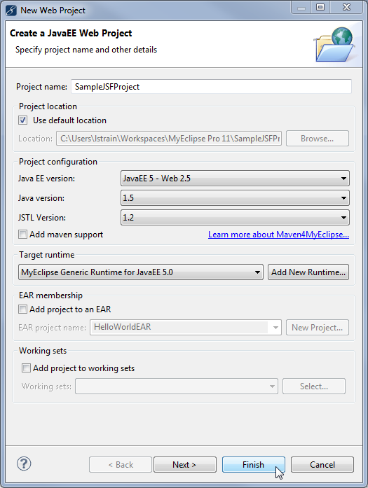
Creating a new Web project
The project structure in the Package Explorer looks like the following: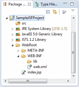
Project structure
Even though Java EE 5.0 contains the JSF libraries, you still need to add the JSF facet to the project so MyEclipse knows to treat the project like a JSF application. - Right-click the project, and select MyEclipse>Project Facets>Install JavaServer Faces Facet.
- Click Next to view implementation settings, and click Finish to accept the defaults.
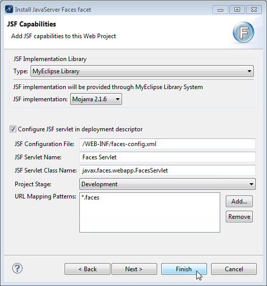
Add JSF Facet window
2. Create a JSF Page
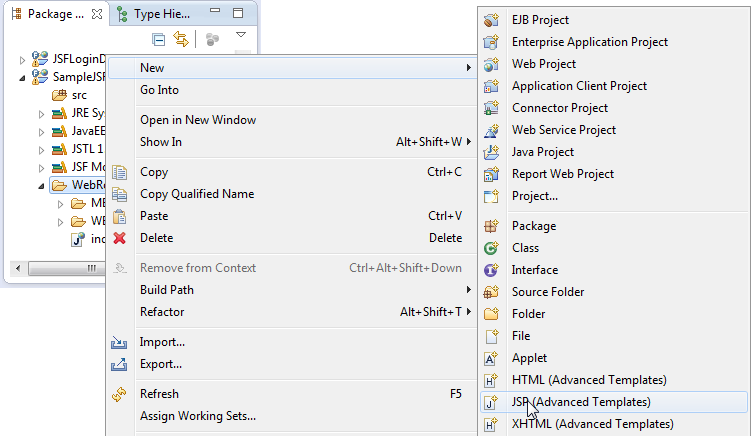
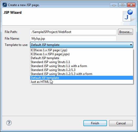
- Right-click the WebRoot folder, and select New>JSP (Advanced Templates).
Creating a new JSP file - Select Default JSF template from the Template to use drop-down, and click Finish. The page opens automatically into the JSP Designer with JSF controls available in the palette.
Create a New JSP Page window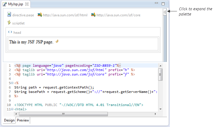
JSP file in the JSF Visual Designer
3. Design the Login Form
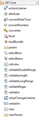
- Click the Expand button to open the tools palette in the Visual Designer. The palette reads the tag libraries from your build path and loads them so you can use the drag and drop feature to build your pages.
Expanding the tools palette
Some of the important tag groups to be aware of are shown below. There are the most common sets of tags you use when designing pages. Use these items to drag and drop a login form onto the page.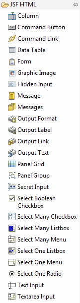
- Select the default text and change it to Welcome to My Application. Please Login:
- Expand JSF HTML in the palette, and drag the Form onto the page below the text.
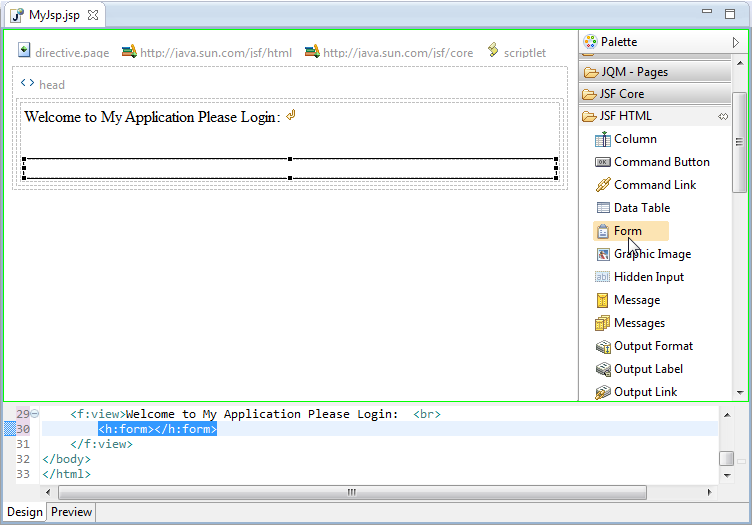
Adding a form and editing text
Layout of a typical login form consists of a username, password, and login buttons. To lay these items out nicely, it seems you need a 3×2 table, but if you want to include space for login error messages, you might use a 3×3 table. The Panel Grid component lays out contents in a table form. - Drag a Panel Grid into the form, and type 3 in the Columns field of the Properties view. The panel grid contains four sample items. As you add/remove items, the layout adjusts.
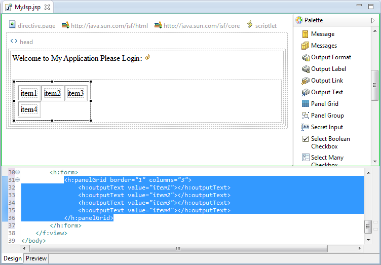
Adding a Panel Grid
When the Panel Grid is added to the page, the Designer automatically adds four sample components to it. - Drag the Output Text component from the toolbar into the first column, first row, and type Username: in the Value field on the Properties view.
- Drag the Text Input component from the toolbar into the second column, first row, and type username in the ID field on the Properties view.
- Drag the Message component from the toolbar into the third column, first row, and type username in the For field.
- Drag the Output Text component from the toolbar into the first column, second row, and type Password: in the Value field on the Properties view.
- Drag the Secret Input component from the toolbar into the second column, second row, and type password in the ID field on the Properties view.
- Drag the Message component from the toolbar into the third column, second row, and type password in the For field.
- Delete the sample items from the grid.
The buttons haven’t been added, but so far, the form looks like this: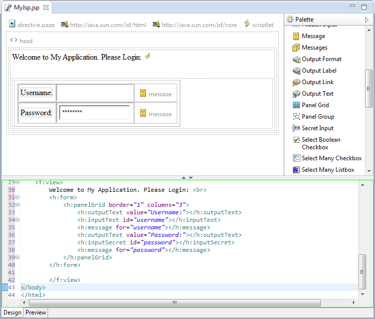
Rendered login page without buttons
Note: The message components are rendered only when they have messages to display.
Given the layout of the login form, you might want to left-align the buttons under the input boxes to make the form look nice. If you place a single button in each cell (one under Password, one under Secret Input) they will be unevenly spaced. However, the Panel Grid takes components added directly to it, and lays them out in a table, cell-by-cell. To group two buttons together and place them under the input fields, you need to use a panelGroup.
First you need an empty component under the Password label. Second, you need to add a panelGroup under the input fields. Then inside the panelGroup, you add your two buttons. - Drag an Output Text component into the cell below the password label, and delete the contents of the Value field in the Properties view. This creates an empty cell.
- Drag the Panel Group component into the cell below the input fields. Drag two Command Button components into the Panel Group, and type Login and Clear into the respective Value fields in the Properties panel.
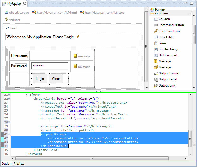
Adding a Panel Group and buttons
Note: It isn’t necessary to add an empty component under the message components.
The design portion of the page is complete and has given you a good idea of how the Designer works. Of course, if you were building a complete JSF application, you would need to assign action handlers to the buttons and value bindings to the input fields to make sure the managed bean is correctly backing the values on this page.