
Visual JSF Designer
Here you will find out how you can make your JSF development faster with this visual designer. You will learn how to:
- Use the designer and design support
- Work with different views and validate
This feature is available in MyEclipse.
1. JSF Designer
MyEclipse’s advanced Visual JSF designer contains many features to speed JSF development. Examples of these include dynamic analysis of the build path to determine the tag libs available on the palette, and rendering of advanced components, e.g. dataTables and panelGrid.
When opening a JSP file, MyEclipse reads the taglib entries to determine if it is a JSF file. If a JSF file is detected, the Visual JSP Designer opens with JSF controls in the palette.
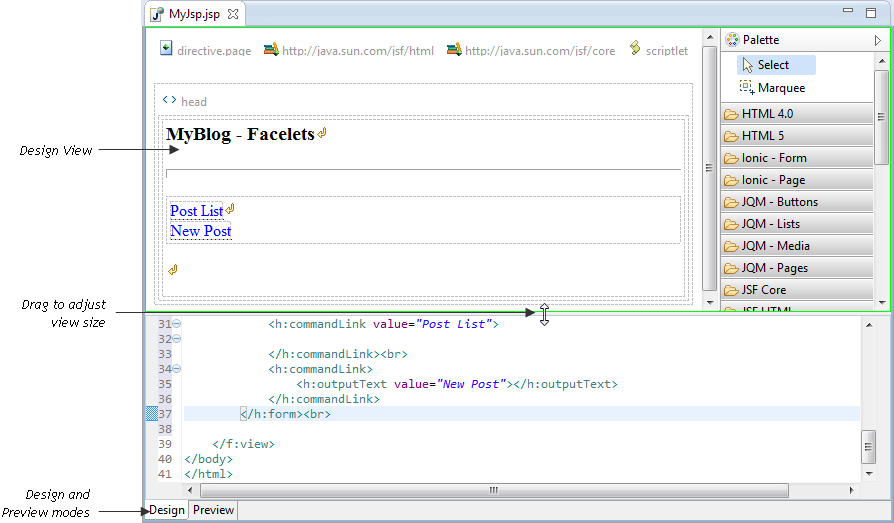
The editor layout of the JSF Designer features a split-page with Design and Source by default. There is a Preview page that can be invoked to see a preview of the current page. Within the Design view there is a embedded toolbar and palette.
MyEclipse Visual JSF Designer
The Palette that is embedded in the Design view has all the JSF HTML and Core components needed for JSF development.
The Ionic palettes available in MyEclipse 2015 CI 11 and later.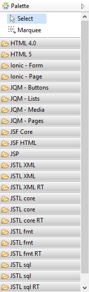
JSF Tools palette
The Preview page shows a preview of the JSF page and renders the components as closely as possible to their runtime behavior. 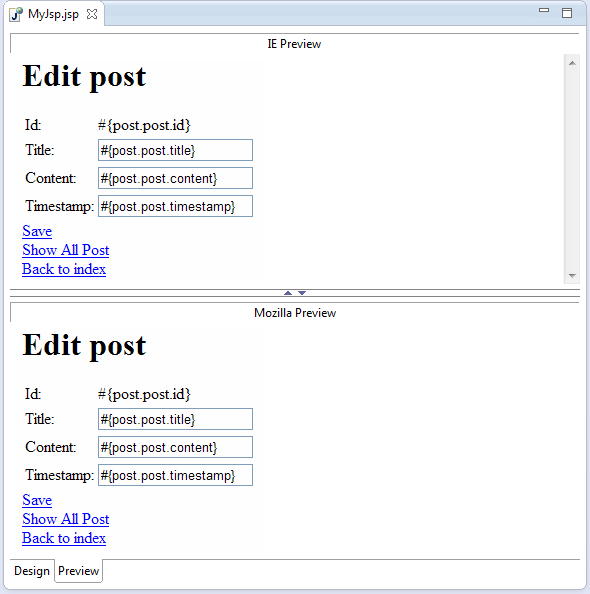
Preview page
2. Design Support for JSF
A WYSIWYG Design view renders JSF components’ approximate behavior at runtime. Many advanced editing features are available directly in Design view and are exposed by a context menu and the Properties view.
- Selection and drag-and-drop support
- Designing from palette
- Context menu
- Non-visual components
- Properties view
2.1 Selection and Drag-and-Drop support
Visual and some non-visual components can be selected by clicking the element in the Design view. The current selection is always shown by a selection box that surrounds the selected element. The supporting Outline and Properties views are synchronized to this selection immediately.
When the pointer is placed over a component, the tool tip text displays the tag name. 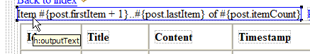
Tooltip text
Non-visual components are also given a visual representation in the Design view and can be selected to show more information.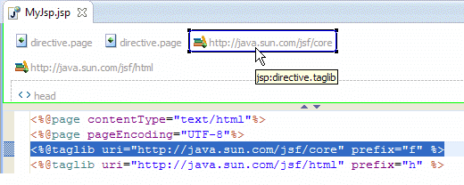
Non-visual element in the Design view
Components in the Design view support advanced drag-and-drop support. Notice in the figure below that you can resort columns by dragging and dropping them in the Design view. After dragging, there are multiple visual cues that show what is being dragged and where the drop location is. Notice how the tool tip gives precise information on where the drop is going to occur.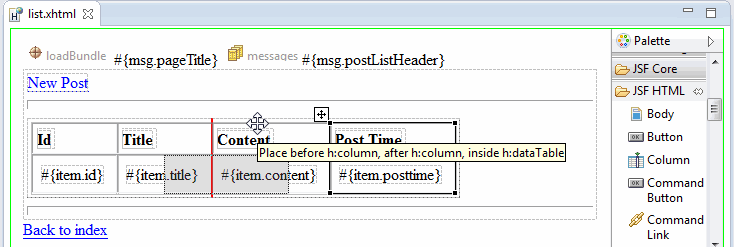
Drag and Drop support
2.2 Design Palette
The JSF HTML and JSF Core components are available in the palette. To add them to the Design view, drag them from the palette to the design canvas. A drop location is displayed before the drop occurs as shown below.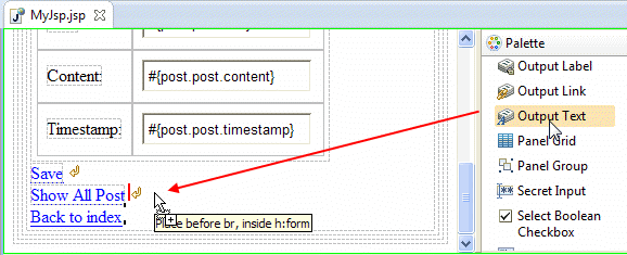
Dragging a component onto the design canvas
For complex layouts with multiple nested components, the Design view makes the location of the boundaries of various nested components clear.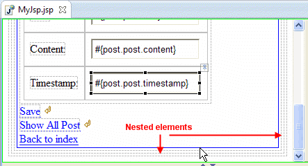
Nested elements
When dropping a component, drop location feedback is shown to make a precise drop possible. This makes designing complex JSF layouts much easier.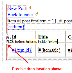
Drop location
2.3 Context Menu
When in the Design view, the right-click context menu is a valuable tool for editing JSF components. For each JSF component, the context menu contains specific edit actions that are available for that JSF component. The image below shows some of the edit actions available in a context menu.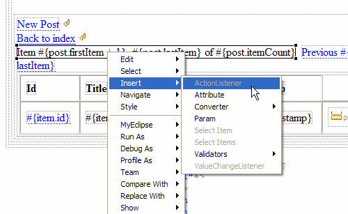
Context menu actions
For JSF dataTables, there are several important context menu actions that make sense in the table context. 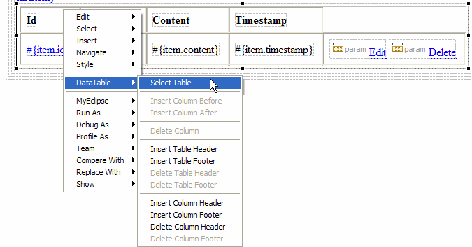
Table context menu actions
2.4 Non-Visual Components
Many JSF components can have nested non-visual tags. In some cases, the JSF Designer allows these non-visual tags to be edited within the Design view. In the image below, notice that the selected tag has a nested JSF core tag that is visible in the Design view.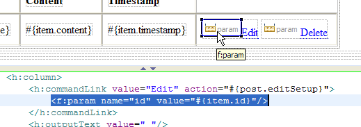
Nested JSF core tag
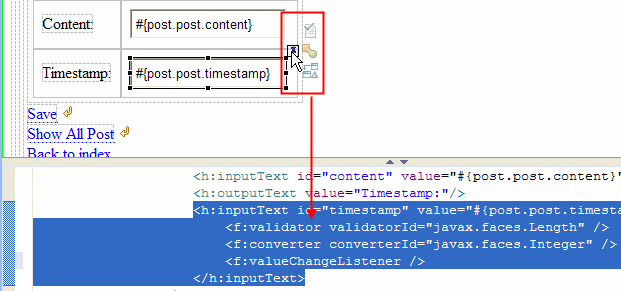
Some non-visual child components such as converters and validators can be seen as a semi-transparent icon located at the top-right of the element.
Non-visual child components
To edit these non-visual components, select the element and notice the pin icon is shown at the top-right of the element. The non-visual component icon can be selected by clicking the pin icon.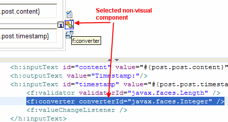
Selecting a non-visual component
2.5 Properties View
As selections are made with the JSF Designer, the Properties view is synchronized to allow editing and inspection of that element’s attributes. The Quick Edit page shows the most frequently used attributes. The Attributes page provides a full list of all the element’s attributes. 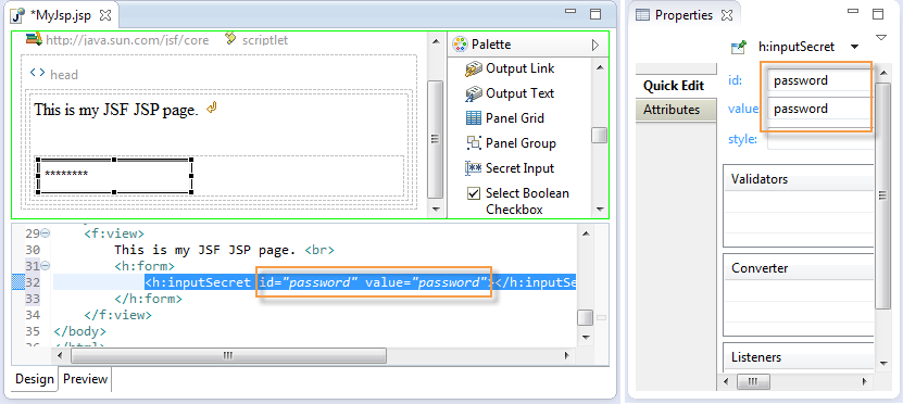
Properties view – Quick Edit page
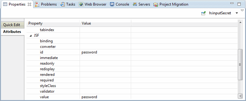
Properties view – Attributes page
The Properties view contains an element navigation drop-down in the top right corner that allows you to select an element’s parent hierarchy. Selecting any element in this list allows you to edit the element’s attributes.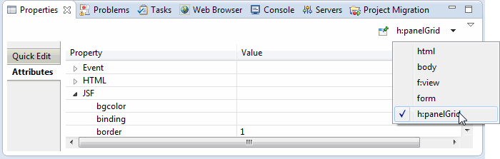
Element navigation drop-down
2.6 Outline View
When the JSF Designer is open, the Outline view allows visual inspection of the DOM structure. You can select elements in the Outline view and also edit them using a right-click context menu. You can also drag elements in the Outline view to reorder the DOM structure.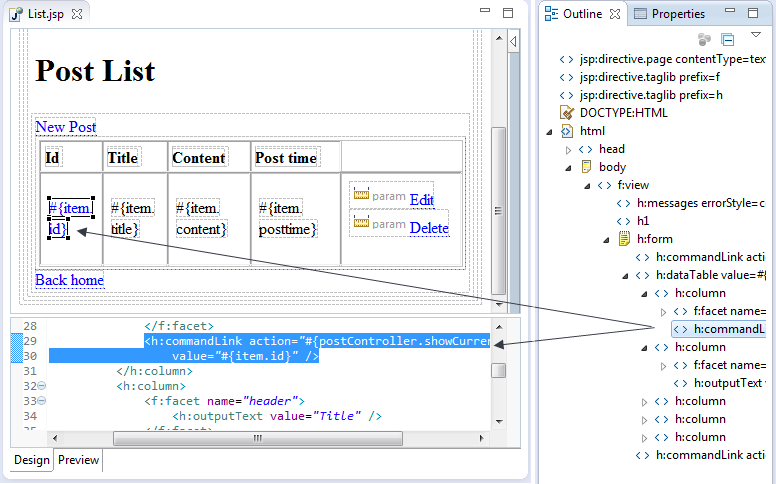
JSF Designer Outline view
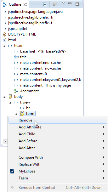
Outline view context menu
3. Source View
The JSF Designer Source view offers code assist and validation. There is code assist for EL attributes, and errors or warnings are shown in both editor rulers and the Problems view.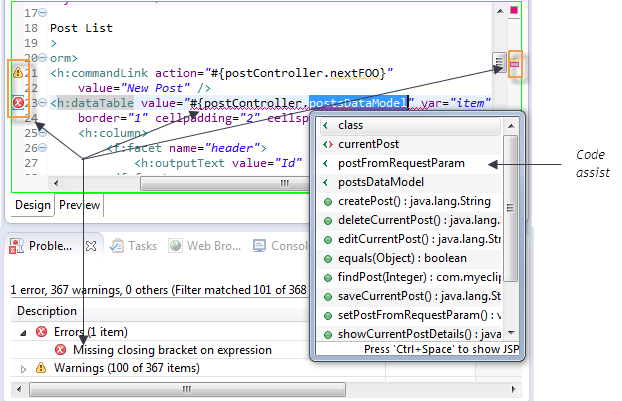
Source view with errors and warning markers
3.1 Enhanced JSF EL and Facelets Code Assist
Code assist and validation of EL contexts is available in Source view. For example, row variables (`var=””`) in a dataTable are validated and the Designer provides code assist for EL variables.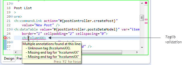
Data table variable validation
Advanced code assist is also available for the h:dataTable var argument, providing content assist inside the scope of the h:dataTable tag for the variable defined with the var attribute.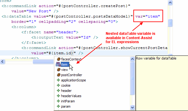
Content assist inside the h:dataTable tag
In addition, if the var is from a strongly-typed collection, (e.g. List<Person>) then the content assist for the var argument inside the h:dataTable tag provides additional insight into the argument’s properties.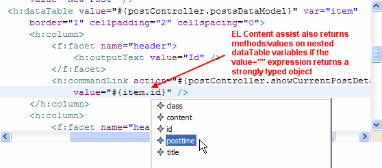
Content assist showing argument properties
Content assist for valid navigation cases is also available in the JSF editor, allowing you to auto complete the action value of tags like commandLink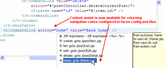
Content assist for valid navigation cases
When editing Facelets XHTML pages, the JSF Designer offers code assist for all Facelets, JSF, and JSTL tags, taglibs, and tag attributes. To enable code assist, you must have the proper namespaces added to the <html> tag. If you select the Default JavaServer Facelets template when you create your XHTML page, the namespaces are included for you. Notice the required namespaces in the image below.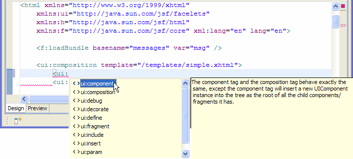
Code assist for tags
Code assist is also available for JSF variables in your XHTML page.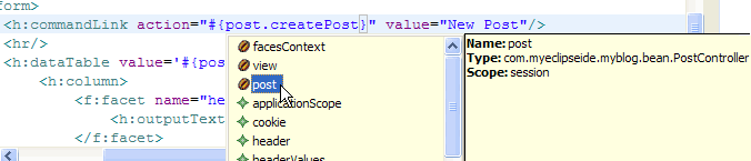
Code assist for JSF variables in Facelets XHTML
3.2 Validation
The JSF Designer Source view supports validation by marking errors and warnings in editor rules, editor source, and the Problems view. There is also “as-you-type” validation of JSF attributes in the Source view.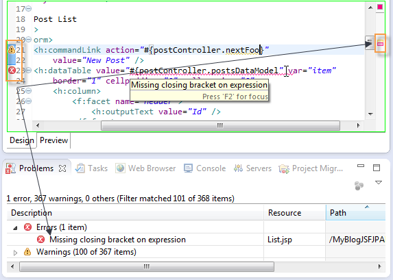
JSF validation support
In addition to these forms of validation, the JSF editor provides validation of navigation cases as defined in the faces-config.xml file, marking invalid navigation cases used in the JSP page.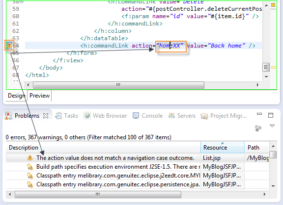
Validation of valid navigation cases
Both tagLib and JSF variable validation is also available for Facelet pages.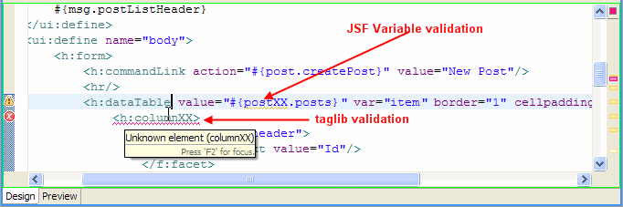
TagLib and JSF variable validation in Facelets pages