Posted on Sep 1st 2017
Angular Material is a set of high-quality UI components developed by the Angular team, based on the Google Material design specification. These components help us to build applications with an attractive, yet familiar UI, giving users a consistent experience across devices.
In this Angular tutorial, you will learn how to set up material design in your Angular app. In the course of this tutorial, we will be using Angular IDE. Let’s get started by firing up our Angular IDE and creating a new Angular project named `AngularMaterialTutorial`.


Install Angular Material and its Dependencies
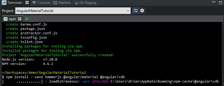
Once the project is created, we can now install additional node modules to our project. Angular IDE has a terminal view from which we can execute commands, so from the menu select `
npm install --save hammerjs @angular/material @angular/cdk
We installed HammerJS because some of the Angular Material components depend on HammerJS for gestures. Modern Angular projects already include the Angular animations module (`@angular/animations`), but if you happen to be following along with an older version of the CLI or Angular, please install that as well.
Using Angular Material Themes
Before we move on to actually using the widgets, let’s get our styles set up.
Material includes a few prebuilt themes that you can find at `node_modules/@angular/material/prebuilt-themes`. If you open that location, you’ll probably notice the following themes:
- deeppurple-amber
- indigo-pink
- pink-bluegrey
- purple-green
In our tutorial, we’re going to use the first – deeppurple-amber, by adding the following line to our global styles file at `/src/styles.css`
@import "~@angular/material/prebuilt-themes/deeppurple-amber.css"
We’re also going to be using font ligatures, for which we need to add the following line to the head section of our `/src/index.html` file, to bring in the Material icons font.
<link href="https://fonts.googleapis.com/icon?family=Material+Icons" rel="stylesheet">
Using Angular Material Components
In this tutorial, we’re going to use a few material buttons, a snackbar, and a menu. We will begin by importing a number of these modules into the `app.module.ts` file – for now you can replace the module’s source with the snippet below, but remember, when you’re working with the source, you can use content assist to have the import automatically added for you, as you can see below.

`/src/app/app.module.ts`
import { BrowserModule } from '@angular/platform-browser';
import { NgModule } from '@angular/core';

import { AppComponent } from './app.component';
import { MdButtonModule, MdButtonToggleModule, MdSnackBarModule, MdMenuModule, MdIconModule } from '@angular/material';
import { BrowserAnimationsModule } from '@angular/platform-browser/animations';

@NgModule({
  declarations: [
    AppComponent
  ],
  imports: [
    BrowserModule,
    MdButtonModule,
    MdButtonToggleModule,
    MdSnackBarModule,
    MdMenuModule,
    MdIconModule,
    BrowserAnimationsModule
  ],
  providers: [],
  bootstrap: [AppComponent]
})

export class AppModule {}
Replace the source of the `app.components.ts` file with the source below, this is really the boilerplate component with an additional `openSnackBar` method that we will use in our template.
`/src/app/app.component.ts`
import { Component } from '@angular/core';
import { MdSnackBar } from '@angular/material';

@Component({
  selector: 'app-root',
  templateUrl: './app.component.html',
  styleUrls: ['./app.component.css']
})
export class AppComponent {

   constructor (public snackBar: MdSnackBar) {}

   openSnackBar(message: string, action: string) {
    this.snackBar.open(message, action, {
      duration: 2000,
    });
  }

}
Finally, replace the `app.component.html` file’s contents with the snippet below. Again, remember that in Angular IDE, Angular content assist is available even within HTML templates.

`/src/app/app.component.html`
<div style="text-align: center">
    <h1>Welcome to the Angular Material Tutorial!</h1>
</div>

<md-icon color="warn">home</md-icon>
<button md-button color="primary">Click me!</button>
<button md-raised-button (click)="openSnackBar('This is a', 'Snackbar!')">Open Snackbar!</button>
<md-button-toggle>Toggle</md-button-toggle>
<md-menu #menu="mdMenu">
  <button md-menu-item>Item 1</button>
  <button md-menu-item>Item 2</button>
</md-menu>
<button md-button [md-menu-trigger-for]="menu">Menu</button>
Notes:
- We’ve used font ligatures, which convert “home” within the md-icon element into a home image instead of displaying the text.
- The color attribute allows us to set the color of icons, buttons, and other widgets as well, by specifying values like primary, accent, or warn. The actual color used would vary from one theme to another.
- The md-menu element itself does nothing, this menu must be triggered from another widget, as we have done using a button.
- Unless the modules corresponding to these widgets are imported, which we did in app.module.ts, you will see errors in your template, autocompletion will not work, and of course, the widgets themselves will be defunct in your app.
Deploying the Application
Allright! It’s time to see our app in action. From the Servers view, expand the `Angular CLI` node and select `AngularMaterialTutorial`. From the toolbar, choose `Start Server`.

Use the Run or Debug context menu actions to automatically open the app in Chrome, or manually open `http://127.0.0.1:4200` in your browser to see the app in action.
Our app should finally look like this:

Conclusion
Angular Material is finely tuned for performance, and fully tested across modern browsers and devices. Whether you’re browsing on a desktop, laptop, tablet, or phone – your app looks great and gives users a solid, capable, browsing experience.
We’ve explored only a few of the Angular widgets in this tutorial, but there are dozens more – you should have no problems utilizing these using similar steps.


